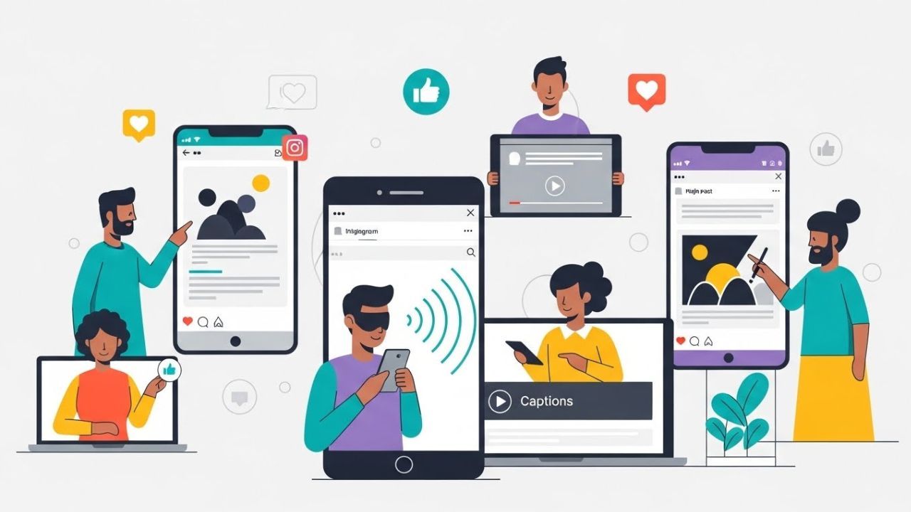
Ensuring accessibility on social media is no longer a “nice to have”—it is an essential responsibility for any creator, brand, or organization that wants to communicate inclusively. Instagram, with its billions of users worldwide, has become a powerful platform for visual storytelling, community-building, and commerce. But because the platform is so visually driven, users with disabilities often encounter barriers that prevent them from accessing content in an equitable way.
This guide explores Instagram’s best practices for accessibility, offering a deep and comprehensive rundown of strategies, examples, and tools that help make content more inclusive for everyone. Whether you’re a creator, marketer, business owner, or casual user, applying accessibility best practices is not only ethical but also improves engagement and SEO, expands your audience reach, and enhances the overall user experience. ♿💡
1. Why Instagram Accessibility Matters
Accessibility is ultimately about ensuring full participation. People with disabilities—including visual, auditory, cognitive, and motor impairments—use Instagram every day. Making content accessible allows these users to engage, interact, learn, share, and participate without barriers.
💡 Key reasons accessibility matters:
- Ethical responsibility — Everyone deserves access to information and communication.
- Legal compliance — Accessibility falls under anti-discrimination laws in many countries.
- Better reach — Accessible content can be discovered and consumed by more users.
- Improved engagement — Content that is clear and well-structured tends to perform better.
- Brand reputation — Accessibility signals care, professionalism, and inclusivity.
Instagram has built-in accessibility tools, but content creators must apply best practices consciously. Many accessibility features aren’t automated, especially when it comes to elements like alt text, video captions, visual hierarchy, and emoji usage.
2. Alt Text: The Cornerstone of Accessible Instagram Content
Alt text (“alternative text”) is a written description of an image that enables people who use screen readers to understand what the image conveys.
✔️ How Instagram Handles Alt Text
Instagram automatically generates alt text using object recognition AI. However:
- The automatic text is often vague.
- It may miss context, mood, or intention.
- It does not describe important details or text in images.
✔️ Best Practices for Writing Effective Alt Text
The best alt text is:
- Concise but descriptive
- Clear and objective
- Structured logically
- Context-specific
📝 Examples of Good vs. Poor Alt Text
| Image Type | Poor Alt Text | Good Alt Text |
|---|---|---|
| Landscape photo | “Mountains” | “Snow-covered mountains at sunrise with orange and pink sky.” |
| Product photo | “Shirt for sale” | “Black cotton T-shirt with a minimalist white geometric print in the center.” |
| Text-only graphic | “Quote” | “Graphic with white text reading ‘Create with intention’ on a teal background.” |
| Group photo | “People smiling” | “Four friends sitting outdoors, smiling at the camera, holding iced coffees.” |
✨ Tips:
- Include details only if relevant to the purpose of the post.
- Don’t start with “image of” or “photo of”—screen readers already indicate this.
- Include text that appears in the image.
- If the image is purely decorative, write minimal alt text or leave it empty.
3. Caption Writing for Accessibility
Captions aren’t just for storytelling—they are essential for screen-reader accessibility, cognitive accessibility, and comprehension.
✔️ Use Clear Structure
Good captions use:
- Short paragraphs
- Line breaks
- Bullet points
- Simple sentence structure
Large blocks of text are difficult to read, especially for users with dyslexia, ADHD, or cognitive impairments.
✔️ Use Descriptive Hashtags
Avoid hashtag overload.
Instead of #brand #instagood #photooftheday (which adds little value), prioritize relevant, descriptive hashtags.
✔️ Avoid Using Only Emojis
Emojis can disrupt screen reader flow. For example:
🌟✨🔥🎉 becomes “glowing star sparkles fire party popper” — distracting for many users.
👍 Emoji rules:
- Use them sparingly
- Place them at the end of sentences, not in the middle
- Avoid repeating the same emoji several times
- Use emojis that enhance meaning
✔️ Provide transcripts when needed
If the caption refers to audio content (like a voice-over reel), include a text transcript in the caption or on an image card.
4. Video Accessibility: Captions, Audio, and Visual Clarity
Video is one of the least accessible formats on Instagram—unless creators take the right steps.
4.1. Captions/Subtitles
Captions are absolutely essential for:
- Deaf and hard-of-hearing users
- People who scroll with sound off
- Non-native speakers
- Users in noisy environments
Instagram allows:
- Auto-generated captions
- Manual captions
- Uploaded captions in Reels
✔️ Best Practices
- Always review auto-captions for accuracy.
- Use proper punctuation.
- Break long sentences across multiple lines.
- Place captions in safe zones (avoid bottom corners where UI may cover text).
4.2. Audio Description (Soft Descriptions)
Formal audio description is not supported directly on Instagram, but creators can integrate soft descriptions:
- Briefly describe onscreen actions within the narration.
- Provide context for visuals that are essential to understanding the message.
Example:
“I’m holding the product now—you can see it’s about the size of my palm with a matte finish.”
4.3. Visual Clarity
Videos should use:
- High contrast colors
- Large readable text
- Simple backgrounds
- Avoid rapid flashing or strobing (this can trigger seizures or motion sensitivity)
🛑 Avoid:
- Text that blends into the background
- Fast transitions
- Overly stylized fonts
5. Color Accessibility and Visual Design
Instagram is visual by nature, which means color, contrast, and composition are key accessibility elements.
5.1. High Contrast Text
Text overlays on images or Reels should:
- Use high contrast between background and foreground
- Avoid thin fonts
- Stay large enough to be read on mobile
Example contrast ratings:
| Text Color | Background | Accessibility |
|---|---|---|
| White | Black | Excellent |
| Black | Pale yellow | Good |
| Red | Pink | Poor |
| Grey | Black | Poor |
5.2. Avoid Color as the Only Means of Communication
Colorblind users may not see distinctions in red/green/blue cues.
Instead of:
“Tap the red button”
Use:
“Tap the red button labeled ‘Submit’.”
5.3. Choose Color-Friendly Palettes
Accessible palettes include:
- Distinct hues
- High brightness differences
- Minimal reliance on saturation
6. Using Hashtags Accessibly
Hashtags can either help or hinder accessibility.
✔️ Use CamelCase (capitalizing each word)
Instead of:
- #thisisanexamplehashtag
Use:
- #ThisIsAnExampleHashtag
Screen readers will pronounce CamelCase more accurately.
✔️ Keep hashtags organized
Best practice:
- Place 1–3 hashtags within the caption
- Place others at the bottom, separated by a line break
- Don’t overload with 25+ hashtags
7. Accessible Formatting for Instagram Stories and Reels
Stories and Reels present unique accessibility challenges because they are:
- Fast-paced
- Design-heavy
- Often rely on text overlays
7.1. Add Captions to Stories
Instagram offers auto-caption stickers.
Always review them for accuracy.
7.2. Add Alt Text via Carousels
Although Stories do not support official alt text, you can:
- Provide descriptions verbally
- Add descriptive text overlays
- Ensure key info is not only visual
8. Accessible Image Carousels
Carousels allow for layered storytelling, but must be designed accessibly.
✔️ Best practices:
- Start with a cover slide containing a summary
- Use consistent layout
- Keep text large and aligned
- Offer text-only versions of complex infographics
- Avoid excessive decorative elements
9. Cognitive Accessibility Considerations
Accessibility also includes users with:
- ADHD
- Dyslexia
- Autism
- Processing disorders
✔️ Tips:
- Keep layouts simple
- Avoid clutter
- Maintain predictable composition
- Use plain language
- Avoid sarcasm or idioms without context
✔️ Dyslexia-friendly text:
- Sans serif fonts
- Wide letter spacing
- Left-aligned paragraphs
- Lowercase where possible
- Avoid italics
10. Accessibility for Motor Impairments
Some users navigate Instagram:
- With limited hand mobility
- Through assistive technology
- Using keyboard-like navigation tools
✔️ Best practices:
- Keep buttons and stickers spaced apart in Stories
- Avoid timed interactions that require fast tapping
- Ensure link stickers are large and visible
- Avoid rapid transitions or overwhelming motion
11. Accessibility for Neurodivergent Users
Neurodivergent users may struggle with overstimulation, fast content, or unpredictable patterns.
✔️ Make content predictable:
- Use consistent formats
- Avoid chaotic visuals
- Provide structure (numbered lists, step-by-step instructions)
12. Accessibility for Users With Low Vision
Even users who are not blind may have:
- Low vision
- Temporary impairments
- Older devices
- Small screens
✔️ Best practices:
- Use large fonts
- Maintain high contrast
- Keep key information away from edges
- Avoid tiny stickers or icons
13. Accessibility Analytics: Measuring Impact
You can monitor accessibility effectiveness by tracking:
- Completion rate of Reels
- Engagement time on carousels
- Saves and shares
- Comments indicating clarity or helpfulness
- Follower growth within diverse communities
14. Accessibility Myths on Instagram
❌ “Alt text is optional.”
Truth: Essential for blind and low-vision users.
❌ “Auto-captions are enough.”
Truth: They are often inaccurate.
❌ “Emojis help everyone.”
Truth: They can hinder screen readers.
❌ “Accessibility is only for people with disabilities.”
Truth: Accessibility improves content for everyone.
15. Advanced Accessibility Tips
✔️ Provide multi-format content
Offer:
- Visual
- Text
- Audio
…so users can choose the format that works best.
✔️ Use accessibility checklists
Before posting:
- Check color contrast
- Read alt text aloud
- Review caption structure
- Test auto-captions
✔️ Educate followers
Promote accessibility awareness through posts or highlights.
16. Example Accessible Post Breakdown
Below is a sample structure of an accessible Instagram post:
- Image: High contrast, text large, minimal clutter
- Alt text: “Dark blue graphic with white text reading ‘Top 5 Time-Saving Workflows’, featuring simple icons of a checklist and clock.”
- Caption:
- Short intro paragraph
- Bullet list of tips
- Summary sentence
- Minimal emojis
- Hashtags:
- #ProductivityTips
- #AccessibleContent
- #WorkflowDesign
Conclusion
Instagram accessibility is not about perfection—it is about consistent effort. Every improvement you make contributes to a platform that includes more voices, more perspectives, and more participation. By following best practices for alt text, captions, color contrast, layout, and formatting, you help create a space where everyone can communicate, learn, and enjoy content equally.
Accessibility is a journey. Start with one small change at a time, and over time, it becomes second nature. When creators embrace inclusive practices, Instagram becomes not just a visual platform, but a truly universal one. ♿🌍✨
Leave a Reply