Scroll through Instagram for just a few seconds and you’ll notice something fascinating: some profiles instantly grab your attention, while others fade into the background. Often, this difference has less to do with the content itself and more to do with color.
Color is not just decoration—it’s communication. It influences mood, perception, decision-making, and even trust. When applied intentionally, color psychology can transform your Instagram feed into a powerful visual brand that attracts, engages, and converts your audience.
In this in-depth guide, we’ll explore how color psychology works, how it affects user behavior on Instagram, and how you can strategically apply it to create a visually compelling, cohesive, and high-performing feed. Along the way, we’ll include practical frameworks, tables, and examples to help you implement everything effectively.
1. Understanding Color Psychology 🧠🌈
Color psychology is the study of how colors influence human emotions and behavior. While interpretations can vary slightly across cultures, many color associations are universal.
Why Color Works
Humans process visuals 60,000 times faster than text. That means your color choices are often the first impression—before someone reads your caption or even understands your content.
Core Emotional Associations
Here’s a foundational table of common colors and their psychological meanings:
| Color | Emotions | Common Uses |
|---|---|---|
| 🔴 Red | Energy, passion, urgency | Sales, fitness, food |
| 🔵 Blue | Trust, calm, professionalism | Tech, finance, wellness |
| 🟡 Yellow | Happiness, optimism, attention | Lifestyle, youth brands |
| 🟢 Green | Growth, nature, balance | Health, sustainability |
| 🟣 Purple | Luxury, creativity, mystery | Beauty, fashion |
| ⚫ Black | Elegance, power, sophistication | High-end brands |
| ⚪ White | Simplicity, cleanliness, clarity | Minimalist aesthetics |
| 🟠 Orange | Enthusiasm, friendliness | Call-to-action content |
| 🟤 Brown | Warmth, reliability, earthiness | Organic brands |
2. The Instagram Feed as a Visual Ecosystem 📸
Your Instagram feed is not just a collection of posts—it’s a curated visual experience. Think of it as your digital storefront.
Key Components of a Feed
- Grid layout (3-column structure)
- Color consistency
- Image style (filters, lighting, composition)
- Content themes
First Impression Rule
Users decide within 1–3 seconds whether to follow you. Color consistency plays a major role here.
3. Building a Color Strategy 🎯
Step 1: Define Your Brand Personality
Before choosing colors, ask:
- Are you bold or minimal?
- Playful or serious?
- Luxury or accessible?
Brand Personality → Color Mapping
| Personality | Recommended Colors |
|---|---|
| Energetic 🔥 | Red, orange |
| Calm 🌿 | Blue, green |
| Elegant 💎 | Black, white, purple |
| Fun 🎉 | Yellow, pink |
| Natural 🌱 | Green, brown |
Step 2: Choose a Core Palette
A strong Instagram feed usually uses:
- 1–2 primary colors
- 2–3 secondary colors
- Neutral tones
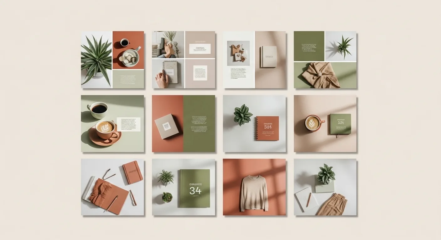
Example Palette
| Role | Color |
|---|---|
| Primary | Soft beige |
| Secondary | Olive green |
| Accent | Terracotta |
| Neutral | White |
Step 3: Apply the 60-30-10 Rule
This classic design rule works perfectly for Instagram:
- 60% dominant color
- 30% secondary color
- 10% accent color
4. Color and Audience Psychology 👥
Different audiences respond differently to color.
Audience-Based Color Preferences
| Audience | Preferred Colors |
|---|---|
| Teens | Bright, bold colors 🎨 |
| Professionals | Blue, gray 🧑💼 |
| Wellness seekers | Green, beige 🌿 |
| Luxury buyers | Black, gold 💰 |
5. Color Consistency vs Variety ⚖️
Consistency Benefits
- Builds brand recognition
- Creates visual harmony
- Makes your feed look professional
But Avoid Monotony
Too much sameness can become boring.
Solution: Controlled Variation
- Use different shades of the same color
- Alternate backgrounds
- Introduce seasonal accents
6. Popular Instagram Color Styles 📊
1. Minimalist Feed ⚪
- Dominated by white, beige, soft tones
- Clean and calming
- Great for lifestyle and wellness
2. Dark Mode Feed ⚫
- Black or dark backgrounds
- Dramatic and high contrast
- Ideal for luxury or edgy brands
3. Vibrant Feed 🌈
- Bright, saturated colors
- High energy and fun
- Works well for creators and influencers
4. Earthy Feed 🌿
- Browns, greens, warm neutrals
- Natural and grounded
- Perfect for eco-conscious brands
7. The Role of Contrast ⚡
Contrast determines readability and visual impact.
High Contrast
- Bold
- Attention-grabbing
- Ideal for calls-to-action
Low Contrast
- Soft
- Elegant
- Better for aesthetic feeds
8. Color and Engagement 📈
What Colors Drive Engagement?
Research and practical observation suggest:
| Goal | Best Colors |
|---|---|
| Clicks | Orange, red |
| Trust | Blue |
| Relaxation | Green |
| Attention | Yellow |
9. Creating a Cohesive Feed 🧩
Techniques
1. Presets and Filters
Use consistent editing styles.
2. Background Control
Stick to similar tones.
3. Color Anchoring
Repeat specific colors across posts.
10. Grid Planning Strategies 🧠
Checkerboard Pattern
Alternate two color styles.
Row-by-Row
Each row has a dominant color.
Puzzle Feed
Images connect visually across posts.
11. Emotional Storytelling Through Color 📖
Color can tell a story over time.
Example
- Monday: Calm blue 🟦
- Wednesday: Energetic orange 🟧
- Friday: Luxurious black ⚫
12. Seasonal Color Adaptation 🍂❄️🌸☀️
| Season | Colors |
|---|---|
| Spring 🌸 | Pastels |
| Summer ☀️ | Bright tones |
| Autumn 🍂 | Warm earthy tones |
| Winter ❄️ | Cool neutrals |
13. Common Mistakes 🚫
❌ Too many colors
❌ No consistency
❌ Ignoring audience
❌ Overusing filters
14. Tools and Techniques 🛠️
- Color palette generators
- Editing apps
- Feed preview tools
15. Case Study Examples (Conceptual)
Case 1: Fitness Brand 💪
- Red + black
- High contrast
- Motivational energy
Case 2: Wellness Page 🌿
- Green + beige
- Soft lighting
- Calm vibe
16. Advanced Techniques 🎓
Color Blocking
Use large areas of solid color.
Gradient Use
Creates depth and modern appeal.
Accent Pop
Small bursts of bright color.
17. The Science Behind Color Decisions 🔬
Color perception is influenced by:
- Culture
- Personal experience
- Context
18. Creating Your Own Signature Style ✍️
Your goal is not to copy—but to own a color identity.
19. Quick Implementation Checklist ✅
- Define brand personality
- Choose palette
- Apply consistency
- Plan grid
- Monitor engagement
20. Final Thoughts 💭
Color is one of the most powerful yet underestimated tools on Instagram. When used strategically, it can:
- Build recognition
- Influence emotions
- Increase engagement
- Strengthen your brand
A well-designed feed doesn’t just look good—it feels right. And that feeling is what keeps people coming back.
Leave a Reply