In the fast-paced world of social media, where attention spans are shorter than ever, visual consistency and immediate appeal are everything. Whether you’re a content creator, brand, or entrepreneur, your Instagram feed acts as your digital storefront. And within that storefront, Reel covers have become one of the most underrated yet powerful tools for shaping perception and driving engagement.
Reels themselves are designed for discovery—algorithmically boosted, entertaining, and often spontaneous. But once they land on your profile, they become part of a larger visual ecosystem: your feed. This is where the tension arises.
👉 How do you balance a cohesive, aesthetically pleasing feed with high-performing, click-worthy Reel covers?
Too much focus on aesthetics can make your covers vague and low-converting. Too much focus on clickbait can disrupt your visual identity and make your profile look chaotic. The sweet spot lies somewhere in between—and that’s exactly what this guide will help you master.
🧠 Understanding the Role of Reel Covers
Before diving into strategies, it’s important to understand why Reel covers matter so much.
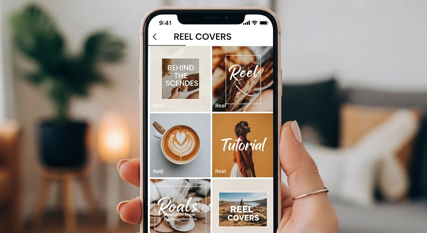
📌 What is a Reel Cover?
A Reel cover is the static image that represents your video in your profile grid and sometimes in the Reels tab. It’s essentially your video’s thumbnail—but unlike platforms like YouTube, it also plays a key role in your feed’s visual harmony.
🎯 Key Functions of Reel Covers
| Function | Description | Impact |
|---|---|---|
| First Impression | It’s what users see before clicking | Determines click-through rate (CTR) |
| Branding | Reinforces your identity and style | Builds recognition |
| Organization | Keeps your feed visually cohesive | Improves profile attractiveness |
| Messaging | Communicates value quickly | Boosts engagement |
⚠️ The Core Dilemma
You’re balancing two competing priorities:
| Aesthetic Focus 🎨 | Click Focus 🖱️ |
|---|---|
| Minimal, clean, cohesive | Bold, attention-grabbing |
| Subtle messaging | Clear, sometimes loud messaging |
| Consistent colors/fonts | Varied styles based on topic |
| “Art gallery” feel | “Content hub” feel |
The goal is not to choose one—but to integrate both intelligently.
🎨 The Psychology Behind Click-Worthy Covers
Let’s talk about what actually makes someone tap on a Reel.
🧩 Human Attention Triggers
Certain elements naturally attract attention:
- Faces (especially expressive ones 😲😄😡)
- High contrast colors
- Large readable text
- Curiosity-driven phrases
- Movement implied in static images
🔍 The Curiosity Gap
A powerful concept in marketing:
Give enough information to spark interest—but not enough to satisfy it.
Example:
- ❌ “How to grow on Instagram”
- ✅ “Why your Instagram isn’t growing (fix this)”
The second creates tension. That tension drives clicks.
💡 Key Insight
👉 Aesthetic feeds often fail because they hide the message.
👉 Clickbait feeds fail because they ignore visual harmony.
The solution is structured creativity.
🧱 Building a Strong Visual Identity
Before optimizing Reel covers, you need a foundation.
🎨 Define Your Visual System
Your feed should follow a consistent design language:
| Element | Examples |
|---|---|
| Color Palette | Pastels, neutrals, bold contrasts |
| Typography | Serif, sans-serif, handwritten |
| Layout Style | Centered, asymmetrical, grid-based |
| Image Style | Bright, moody, minimal, textured |
📊 Example Visual Identity Framework
| Component | Rule |
|---|---|
| Background | Always light beige |
| Text Color | Dark brown |
| Font | Clean sans-serif |
| Accent | One highlight color (e.g., orange 🍊) |
| Spacing | Consistent margins |
🎯 Why This Matters
Consistency creates:
- Recognition 👀
- Trust 🤝
- Professionalism 💼
But here’s the catch:
👉 Consistency should guide—not restrict.
⚖️ Balancing Aesthetic and Performance
Now we get to the core of the topic.
🔥 Strategy 1: Use “Structured Consistency”
Instead of making every cover identical, create a system with flexibility.
Example:
| Element | Fixed | Flexible |
|---|---|---|
| Font | ✅ | ❌ |
| Colors | ✅ | ❌ |
| Text Size | ❌ | ✅ |
| Image | ❌ | ✅ |
| Layout | Semi-fixed | Semi-flexible |
👉 Think of it like a template—not a cage.
🧠 Strategy 2: Prioritize Readability
Your cover should be understandable in less than 1 second.
📏 Best Practices
- Use 3–6 words max
- Ensure high contrast
- Avoid clutter
- Use bold typography
❌ Bad Example
“5 different strategies that you can use today to improve your Instagram engagement”
✅ Good Example
“5 Growth Hacks 🚀”
🎭 Strategy 3: Add Emotion Without Chaos
You don’t need loud neon colors to get clicks.
Instead, use:
- Facial expressions 😮
- Subtle contrast
- Strategic highlights
- Cropping that creates tension
🎯 Strategy 4: Create Visual Hierarchy
Guide the viewer’s eye.
Example Layout
[ Big Bold Text ]
     ↓
[ Supporting Image ]
     ↓
[ Small Accent Element ]
🧩 Hierarchy Table
| Level | Element | Purpose |
|---|---|---|
| 1 | Main Text | Hook |
| 2 | Image | Context |
| 3 | Accent | Detail |
🎨 Strategy 5: Design for the Grid
Your Reel cover doesn’t live alone—it lives in your grid.
📱 Grid Perspective
Ask yourself:
- Does it clash with neighboring posts?
- Does it break the visual rhythm?
- Does it feel “on brand”?
🔲 Grid Harmony Example
| Row | Visual Strategy |
|---|---|
| Row 1 | Light backgrounds |
| Row 2 | Dark accents |
| Row 3 | Mixed visuals |
👉 Think in patterns, not individual posts.
🚀 Advanced Techniques
Now let’s go deeper.
🎯 Technique 1: The “Invisible Branding” Method
Make your covers recognizable without obvious branding.
How?
- Same spacing
- Same text placement
- Same color tone
- Same editing style
👉 Users should recognize your content instantly—even without logos.
🔍 Technique 2: Micro-Contrast
Instead of dramatic contrast, use subtle contrast shifts.
Example:
- Beige background + slightly darker beige box
- Soft shadow for depth
- Slight blur behind text
👉 Elegant yet effective.
🧠 Technique 3: Pattern Interrupts
Occasionally break your aesthetic—on purpose.
Why?
Humans notice differences.
Example:
If your feed is:
- Minimal → Add one bold cover
- Neutral → Add one vibrant post
- Text-heavy → Add one image-focused cover
👉 This boosts clicks without destroying your identity.
🔄 Technique 4: A/B Testing Covers
Yes—you can test covers.
How:
- Post Reel with Cover A
- After 24–48h, change to Cover B
- Compare performance
📊 Metrics to Watch
| Metric | Meaning |
|---|---|
| Views | Initial attraction |
| Likes | Appeal |
| Saves | Value |
| Shares | Virality |
🧩 Common Mistakes to Avoid
❌ Mistake 1: Over-Minimalism
Looks beautiful… but no one clicks.
❌ Mistake 2: Overcrowding
Too much text = confusion.
❌ Mistake 3: Inconsistent Branding
Each cover looks like a different account.
❌ Mistake 4: Ignoring Mobile View
Most users see tiny thumbnails.
❌ Mistake 5: Following Trends Blindly
Trendy ≠ effective for your brand.
📊 Aesthetic vs Click Performance Comparison
| Approach | Pros | Cons | Best For |
|---|---|---|---|
| Pure Aesthetic 🎨 | Beautiful feed | Low CTR | Artists, portfolios |
| Pure Clickbait 🖱️ | High clicks | Messy feed | Viral creators |
| Balanced ⚖️ | Strong brand + clicks | Requires effort | Most creators |
🛠️ Practical Workflow
Here’s a step-by-step system you can follow.
🧭 Step 1: Define Your Style
- Choose colors 🎨
- Choose fonts 🔤
- Choose layout 📐
✏️ Step 2: Create 3–5 Templates
Different formats for different content types:
| Template | Use Case |
|---|---|
| Text-heavy | Tips & tutorials |
| Image-focused | Personal content |
| Mixed | Educational storytelling |
🎬 Step 3: Design Each Cover
Checklist:
- Is it readable? 👀
- Is it clickable? 🖱️
- Does it match my feed? 🎨
📱 Step 4: Preview in Grid
Always check how it looks in your profile.
🔄 Step 5: Optimize Over Time
Track what works and refine.
💡 Real-World Style Examples
🧘 Minimal Creator
- Soft colors
- Small text
- Clean layout
👉 Needs stronger hooks.
📈 Growth Creator
- Bold text
- High contrast
- Clear messaging
👉 Needs better cohesion.
🧠 Hybrid Creator (Ideal)
- Clean but clear
- Branded but bold
- Aesthetic but readable
🎯 The Golden Formula
Here’s the key takeaway:
🎨 Consistency builds trust
🖱️ Clarity drives clicks
⚖️ Balance creates growth
🧪 Experiment Ideas
Try these:
- Emoji vs no emoji 😊
- Face vs no face 👤
- Question vs statement ❓
- Light vs dark background 🌗
🔮 Future Trends
Reel covers are evolving:
- More cinematic thumbnails 🎥
- AI-generated visuals 🤖
- Motion-inspired design 💫
- Ultra-clean branding 🧼
🧠 Final Thoughts
Your Instagram feed is not just a gallery—it’s a strategic tool.
Reel covers sit at the intersection of:
- Art 🎨
- Psychology 🧠
- Marketing 📈
If you lean too far in one direction, you lose effectiveness. But when you master the balance, something powerful happens:
👉 Your feed becomes both beautiful and functional.
👉 Your content gets both admired and clicked.
And that’s the real goal.
Leave a Reply