
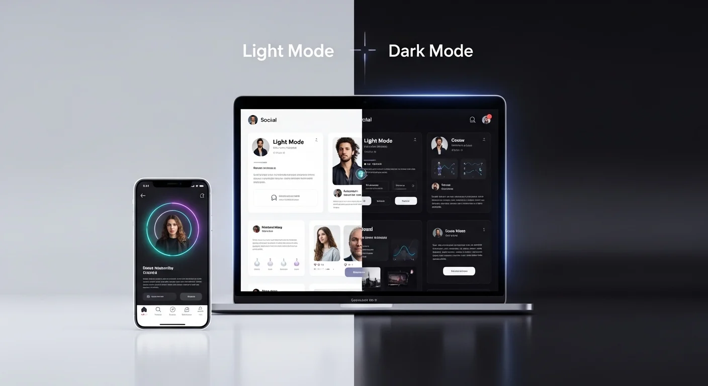
Over the past decade, digital design has undergone a significant transformation. One of the most notable trends is the rise of Dark Mode—a user interface setting that replaces light backgrounds with darker tones. What started as a niche feature for developers and night-time readers has now become a mainstream design preference across apps, websites, and operating systems.
Dark Mode is no longer just an aesthetic choice; it has profound implications for user experience (UX), visual hierarchy, branding, and especially post design—whether for social media, blogs, emails, or digital marketing campaigns.
This article explores in depth how Dark Mode affects your post design, why it matters, and how to optimize your content for both light and dark environments.
🌑 1. Understanding Dark Mode
What is Dark Mode?
Dark Mode is a display setting where:
- Backgrounds are dark (black, charcoal, deep gray)
- Text is light (white or light gray)
- UI elements adapt to reduced brightness
Why Users Prefer It
Users are increasingly adopting Dark Mode for several reasons:
| Reason | Explanation |
|---|---|
| 👁️ Reduced eye strain | Especially in low-light environments |
| 🔋 Battery saving | OLED/AMOLED screens consume less power |
| 🌙 Night usability | More comfortable for evening browsing |
| 🎨 Aesthetic appeal | Modern, sleek, and minimal look |
🎯 2. Why Dark Mode Matters for Post Design
When designing posts, creators often assume a light background environment. However, with Dark Mode:
👉 Your design may appear completely different
👉 Colors can shift or lose contrast
👉 Text readability may decrease
👉 Branding elements can break visually
Key Insight
A design that looks perfect in Light Mode can become unreadable or visually broken in Dark Mode.
🎨 3. Color Behavior in Dark Mode
3.1 Color Inversion & Perception
Colors behave differently on dark backgrounds:
- Bright colors appear more vibrant
- Saturated colors may feel overpowering
- Subtle tones can become invisible
Example Table
| Color Type | Light Mode Effect | Dark Mode Effect |
|---|---|---|
| Bright Blue 🔵 | Calm, readable | Glowing, intense |
| Light Gray ⚪ | Soft | Almost invisible |
| Red 🔴 | Strong | Aggressive |
| Pastel Colors 🎨 | Gentle | Washed out |
3.2 Contrast is Everything
Contrast becomes even more critical in Dark Mode.
Good Contrast Example:
- White text on dark gray ✅
Bad Contrast Example:
- Medium gray text on black ❌
3.3 Avoid Pure Black and Pure White
Designers often think:
“Dark Mode = pure black background”
But that’s not ideal.
Better Approach:
- Use dark gray (#121212) instead of pure black
- Use off-white (#E0E0E0) instead of pure white
Why?
- Reduces eye fatigue 👁️
- Improves readability 📖
- Looks more premium ✨
🧠 4. Psychological Impact of Dark Mode
Dark Mode influences how users feel:
| Element | Emotional Impact |
|---|---|
| Dark backgrounds | Sophistication, focus, calm |
| Bright accents | Energy, urgency |
| High contrast | Attention, clarity |
Key Takeaway
Dark Mode creates a more immersive and focused environment, which can:
- Increase reading time 📚
- Improve content engagement 📈
- Highlight key elements better 🎯
🧩 5. Challenges in Designing for Dark Mode
5.1 Brand Identity Issues
Logos designed for light backgrounds may:
- Disappear in dark environments
- Lose contrast
- Look inconsistent
Solution:
Create dual versions of your assets:
- Light Mode version
- Dark Mode version
5.2 Image Rendering Problems
Images with:
- Transparent backgrounds
- Light edges
- White text overlays
…can break visually in Dark Mode.
Common Issues:
- White halos around images 😬
- Invisible icons 😶
- Blending problems
5.3 Text Readability
Thin fonts and low contrast text become problematic.
Avoid:
- Light gray on dark gray ❌
- Thin font weights ❌
Use:
- Medium/bold fonts ✅
- High contrast combinations ✅
📱 6. Dark Mode in Social Media Posts
6.1 Platform Behavior
Different platforms handle Dark Mode differently:
| Platform | Dark Mode Behavior |
|---|---|
| Instagram 📸 | Background changes, posts stay same |
| Twitter 🐦 | Full UI dark adaptation |
| LinkedIn 💼 | Mixed behavior |
| Facebook 📘 | Full dark UI |
6.2 Post Design Implications
Your post sits inside a dark UI frame, which means:
- Borders may disappear
- White backgrounds may feel too bright
- Colors may clash with UI
6.3 Best Practices
Use Neutral Backgrounds
- Avoid pure white
- Use soft tones
Add Padding
- Prevent content from blending into UI
Use Clear Hierarchy
- Headlines must stand out
✉️ 7. Dark Mode in Email Design
Dark Mode is especially tricky in emails.
7.1 Automatic Color Inversion
Email clients may:
- Invert colors automatically
- Change background and text unpredictably
7.2 Common Issues
| Issue | Example |
|---|---|
| Logo disappears | White logo on inverted white background |
| Buttons break | Color inversion ruins CTA |
| Text unreadable | Low contrast after inversion |
7.3 Solutions
Use Transparent Logos
Add Background Colors to Images
Test in Multiple Clients
🖼️ 8. Typography in Dark Mode
Typography plays a huge role.
8.1 Font Weight Matters
- Thin fonts → harder to read
- Bold fonts → clearer
8.2 Line Spacing
Dark backgrounds require:
- Slightly increased spacing
- Better readability
8.3 Font Color
Best options:
| Color | Use Case |
|---|---|
| White (#FFFFFF) | Headlines |
| Light Gray (#E0E0E0) | Body text |
| Accent colors | Highlights |
🎯 9. Visual Hierarchy in Dark Mode
Hierarchy becomes more noticeable in Dark Mode.
Why?
Because contrast is stronger.
9.1 Use of Light
In Dark Mode:
👉 Light elements attract attention
Use this strategically:
- Highlight CTAs 🔘
- Emphasize headlines 📰
- Guide user flow ➡️
9.2 Layering
Use shadows and elevation carefully:
- Too much shadow = muddy design
- Subtle elevation = clarity
🎨 10. Color Strategy for Dark Mode
10.1 Accent Colors
Bright colors work well:
- Cyan 🔷
- Purple 🟣
- Neon green 🟢
10.2 Avoid Over-Saturation
Too many bright colors can:
- Overwhelm users 😵
- Reduce readability
10.3 Recommended Palette
| Element | Suggested Color |
|---|---|
| Background | #121212 |
| Surface | #1E1E1E |
| Text | #E0E0E0 |
| Accent | #BB86FC |
📊 11. Before vs After: Design Comparison
| Aspect | Light Mode | Dark Mode |
|---|---|---|
| Readability | High | High (if optimized) |
| Eye strain | Higher | Lower |
| Battery usage | Higher | Lower |
| Visual impact | Standard | Strong |
🧪 12. Testing Your Designs
Testing is essential.
12.1 What to Test
- Text readability 👀
- Image visibility 🖼️
- Brand consistency 🎨
- CTA clarity 🔘
12.2 Tools & Methods
- Device testing 📱
- Emulator tools 💻
- Manual toggling 🔄
🚀 13. Advanced Tips for Designers
13.1 Design for Both Modes First
Don’t adapt later—design with both in mind.
13.2 Use Design Systems
Create:
- Color tokens 🎨
- Typography rules 🔤
- Component libraries 🧩
13.3 Think Contextually
Ask:
👉 Where will this post appear?
👉 What background surrounds it?
🧠 14. Future of Dark Mode in Design
Dark Mode is not a trend—it’s a standard.
Expected Developments:
- Smarter adaptive UIs 🤖
- AI-driven color adjustments 🎨
- Personalized themes 👤
✅ 15. Key Takeaways
- Dark Mode changes how users perceive your design
- Contrast is the most important factor
- Colors behave differently on dark backgrounds
- Testing is essential
- Designing for both modes is now mandatory
🎯 Conclusion
Dark Mode has fundamentally reshaped digital design. It challenges designers to rethink everything—from color selection to typography and visual hierarchy.
Ignoring Dark Mode is no longer an option. Whether you’re creating social media posts, email campaigns, or UI components, your designs must be adaptive, flexible, and user-centered.
By understanding its impact and applying the right strategies, you can create posts that not only survive Dark Mode—but truly shine in it. 🌟
Leave a Reply