Instagram has evolved from a photo-sharing app into a visual storytelling platform where cohesive aesthetics drive engagement and brand identity. Designing a visually pleasing Instagram grid isn’t just about individual posts, but how each piece contributes to a holistic narrative. Whether you’re an influencer, brand, or casual creative, understanding how to craft a cohesive grid aesthetic can significantly elevate your profile. In this article, we will explore every essential aspect of designing a compelling Instagram grid, including style selection, color palette, planning tools, thematic consistency, and best practices.
1. Understanding the Power of a Grid Aesthetic
The Instagram profile grid is the first impression. A unified aesthetic conveys professionalism, thoughtfulness, and intention. A well-designed grid helps to:
- Increase engagement
- Improve brand recognition
- Build trust and credibility
- Encourage new followers
People are drawn to accounts that have a visually harmonious layout. Aesthetics play a subconscious role in forming opinions. A grid that flows naturally and consistently provides a better user experience.
2. Choosing Your Aesthetic Style
Start by identifying the aesthetic that best aligns with your brand or personal vibe. Some popular Instagram aesthetic styles include:
- Minimalist: Clean, simple, with lots of white space.
- Vintage: Muted colors, grainy filters, retro vibes.
- Bold & Colorful: Bright hues, contrast, energy-packed visuals.
- Dark & Moody: Deep tones, shadows, dramatic ambiance.
- Pastel: Soft colors, dreamy and gentle visuals.
- Editorial: Magazine-style layouts, high-fashion look.
To find your style:
- Browse Pinterest, Behance, or top Instagram accounts
- Save images and posts that resonate with you
- Identify recurring themes and elements
3. Building a Consistent Color Palette
Color is the backbone of visual cohesion. A consistent palette ensures that your posts look unified, even if they feature different subjects.
Tips to Build Your Color Palette:
- Choose 3–5 primary colors
- Include accent and background colors
- Use color wheel tools like Adobe Color or Coolors
- Stick to your palette in all visual content
Example: For a beach lifestyle aesthetic:
- Blues (ocean)
- Sandy beige (beach)
- Coral (sunset)
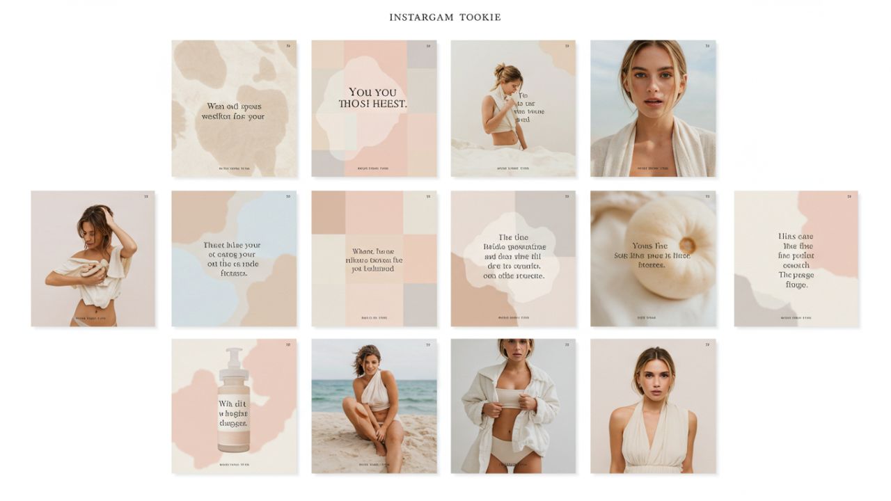
4. Planning Grid Layouts
Instagram displays posts in rows of three. Smart layout planning ensures your grid tells a story or maintains a pattern.
Popular Layout Styles:
- Tiles or Checkerboard: Alternate post types (e.g., photo, quote)
- Rows: Each row has a unique theme
- Columns: One column for quotes, one for images, etc.
- Rainbow Feed: Gradual color changes down the grid
- Puzzle Feed: One large image broken into multiple posts
Use tools like:
- Preview App
- Planoly
- UNUM
- Canva (Grid Templates)
These tools allow you to drag and rearrange posts before publishing.
5. Visual Elements and Composition
Pay attention to what’s inside your photos. Cohesion comes from composition as well as color.
Things to consider:
- Lighting consistency (natural vs. studio)
- Photo angles and framing
- Backgrounds and props
- Fonts and overlays
- Editing style and filters
Keep editing uniform by using the same filter or preset on every photo (Lightroom, VSCO, Snapseed).
6. Establishing Content Themes
A theme is the recurring subject matter or tone of your content. Consistency in theme creates familiarity.
Example Themes:
- Travel: Landscapes, local culture, packing tips
- Fitness: Workouts, meals, motivational quotes
- Fashion: Outfits, product flat lays, styling videos
How to Define Yours:
- Pick 3–5 content categories
- Alternate between them to keep feed dynamic
- Maintain visual cohesion despite variety
7. Posting Strategy for Cohesion
Content planning and timing can make or break your aesthetic.
Best Practices:
- Batch create and edit content
- Use a content calendar
- Maintain visual spacing (e.g., avoid placing two busy images side by side)
- Post in multiples of three for grid alignment
8. Using Templates and Presets
Templates help maintain uniformity in posts like quotes or tips. Presets (especially in Lightroom) apply consistent edits across images.
Resources:
- Canva (for templates)
- Creative Market (for presets)
- Etsy or Gumroad (custom Lightroom presets)
9. Brand Alignment and Identity
For businesses and creators, your Instagram aesthetic should mirror your brand identity.
Questions to Ask:
- What emotions do I want to evoke?
- Does my aesthetic reflect my niche?
- Are my fonts, colors, and messaging consistent?
Examples:
- Eco brands may use earthy tones and organic imagery.
- Tech brands may use clean lines and bold typography.
10. Measuring Success and Iterating
Monitor how your aesthetic affects performance.
Track:
- Follower growth
- Engagement rate (likes, shares, comments)
- Website clicks or conversions
Use Instagram Insights or tools like Later, Iconosquare, or Metricool.
Be open to evolution. Your grid should grow with your brand.
Conclusion
Creating a cohesive Instagram grid aesthetic is part art, part strategy. With careful planning, a clear vision, and the right tools, your Instagram profile can become a powerful visual portfolio. Stick to your theme, maintain color and composition consistency, and regularly evaluate performance. Whether you’re building a personal brand, business, or passion project—your grid is your visual voice.
Stay consistent, but allow space for creativity and growth.
Leave a Reply