In the fast-moving world of social media, Stories have become one of the most powerful tools for communication, branding, and storytelling. Whether you’re using Instagram, Facebook, TikTok, or any other platform with a Stories feature, the challenge remains the same: how do you make your Stories look professional without relying on external design tools?
The good news is that you don’t need Photoshop, Canva, or any advanced software to create stunning visuals. Modern apps already come packed with powerful features—you just need to know how to use them strategically.
This comprehensive guide will walk you through everything you need to know to elevate your Stories layouts using only the app. From design fundamentals to advanced tricks, you’ll learn how to transform simple posts into polished, professional content.
📌 Table of Contents
| Section | Topic |
|---|---|
| 1 | Understanding the Power of Stories |
| 2 | Core Design Principles |
| 3 | Layout Techniques |
| 4 | Typography Mastery |
| 5 | Color and Branding |
| 6 | Using Stickers and Native Tools |
| 7 | Visual Hierarchy |
| 8 | Content Structuring |
| 9 | Animation and Motion |
| 10 | Consistency and Templates |
| 11 | Common Mistakes |
| 12 | Advanced Tips |
| 13 | Final Thoughts |
1. Understanding the Power of Stories 🚀
Stories are temporary, but their impact is immediate. They:
- Capture attention quickly
- Encourage interaction
- Feel more authentic than feed posts
- Allow experimentation
Professional-looking Stories don’t just “look nice”—they increase engagement, credibility, and trust.
2. Core Design Principles 🎨
Before jumping into tools, you need to understand the basics of design.
✳️ Balance
Balance ensures that your Story doesn’t feel too heavy on one side.
| Type of Balance | Description |
|---|---|
| Symmetrical | Equal distribution on both sides |
| Asymmetrical | Different elements balanced visually |
| Radial | Center-focused layout |
👉 Tip: If your text is on the left, balance it with a visual element on the right.
✳️ Alignment
Alignment creates order.
- Left-aligned → clean and modern
- Centered → bold and simple
- Right-aligned → less common but stylish
📌 Always align elements intentionally—not randomly.
✳️ Spacing (White Space)
White space is what separates amateur from professional design.
- Avoid clutter
- Give elements breathing room
- Focus attention
✨ Rule: If it feels crowded, remove something.
✳️ Contrast
Contrast creates emphasis.
- Light vs dark
- Big vs small
- Bold vs thin
👉 Without contrast, everything looks flat.
3. Layout Techniques 📐
Now let’s get practical.
🔲 The Grid Method
Even if the app doesn’t show a grid, you can mentally divide your screen.
Example grid:
| Area | Use |
|---|---|
| Top | Titles / headlines |
| Middle | Main content |
| Bottom | CTA (call to action) |
🔳 Rule of Thirds
Divide the screen into 3 horizontal sections.
- Place key elements along these lines
- Avoid placing everything in the center
📱 This creates a more dynamic composition.
🔲 Layering
Layering adds depth.
Example:
- Background (image or color)
- Overlay (gradient or shape)
- Text
- Stickers/icons
✨ Result: A richer, more professional look.
4. Typography Mastery ✍️
Text is often the main element in Stories.
🔤 Font Pairing
Most apps offer limited fonts—but that’s enough.
| Combination | Style |
|---|---|
| Bold + Thin | Modern |
| Serif + Sans-serif | Elegant |
| Script + Simple | Creative |
👉 Don’t use more than 2–3 fonts.
🔠 Text Hierarchy
Make it clear what should be read first.
Example:
- BIG TITLE
- Subtitle
- Small details
📌 Use size, weight, and spacing.
✏️ Text Placement Tips
- Avoid edges (some UI overlaps)
- Keep margins consistent
- Don’t cover important visuals
5. Color and Branding 🎨
Color can make or break your design.
🌈 Stick to a Palette
Choose 2–4 colors.
| Type | Example Use |
|---|---|
| Primary | Main text |
| Secondary | Background |
| Accent | Highlights |
🎯 Use Contrast Smartly
- Dark background + light text
- Light background + dark text
Avoid low contrast—it looks unprofessional.
🧠 Branding Tip
Use the same colors consistently so people recognize your content instantly.
6. Using Stickers and Native Tools 🧩
Apps provide powerful built-in tools:
⭐ Stickers
- Polls
- Questions
- GIFs
- Emojis
👉 Use them intentionally, not randomly.
🖌️ Drawing Tool
You can:
- Create backgrounds
- Highlight text
- Draw shapes
✨ Pro tip: Use the highlighter tool to create soft overlays.
📌 Shapes Trick
Many apps don’t have shapes—but you can fake them:
- Type “.” or “_”
- Resize it
- Create lines or blocks
7. Visual Hierarchy 👁️
Hierarchy guides the viewer’s eye.
🧭 Flow Pattern
Most people read Stories like this:
- Top
- Center
- Bottom
Design accordingly.
🎯 Focal Point
Every Story should have ONE main focus.
Ask yourself:
👉 “What is the first thing people should notice?”
8. Content Structuring 📖
Professional Stories are not random—they tell a story.
📚 Story Sequence Example
| Slide | Content |
|---|---|
| 1 | Hook |
| 2 | Context |
| 3 | Value |
| 4 | CTA |
🔥 Hook Ideas
- Questions
- Bold statements
- Surprising facts
Example:
👉 “You’re designing Stories wrong.”
📢 Call to Action (CTA)
Always guide the viewer.
Examples:
- “Swipe up”
- “Reply here”
- “Vote in the poll”
9. Animation and Motion 🎞️
Movement adds life.
⚡ Subtle Animations
- Fade-in text
- Slide transitions
- Sticker motion
Avoid overdoing it.
⏱️ Timing
- Don’t make animations too fast
- Give time to read
🎯 Focus Tip
Animate only what matters.
10. Consistency and Templates 📊
Consistency builds professionalism.
🧩 Create a Style System
Define:
- Fonts
- Colors
- Layout style
📐 Template Strategy
Even inside the app, you can:
- Reuse layouts
- Screenshot and replicate
- Keep structure consistent
11. Common Mistakes ❌
Avoid these:
🚫 Overcrowding
Too many elements = confusion
🚫 Too Many Fonts
Looks chaotic
🚫 Poor Contrast
Hard to read = people skip
🚫 Misalignment
Makes design feel amateur
🚫 Random Colors
No identity
12. Advanced Tips 💡
🧠 Use Negative Space
Empty space = elegance
🔍 Zoom Trick
Zoom backgrounds slightly to create depth.
🎭 Transparency Layers
Add overlays to improve readability.
🔄 Repetition
Repeat elements for cohesion.
🧩 Minimalism
Less is more.
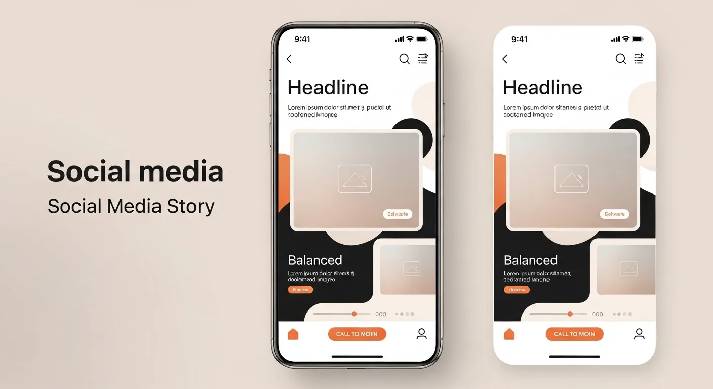
13. Example Layout Breakdown 📊
| Element | Position | Purpose |
|---|---|---|
| Title | Top | Grab attention |
| Image | Center | Visual focus |
| Text | Middle | Information |
| CTA | Bottom | Action |
14. Quick Checklist ✅
Before posting:
- ✔ Is it clean?
- ✔ Is it readable?
- ✔ Is there a clear focus?
- ✔ Is it aligned?
- ✔ Does it match your style?
Final Thoughts 🌟
Creating professional Stories is not about having the best tools—it’s about using simple tools intelligently.
With:
- Good layout
- Clear hierarchy
- Consistent design
- Thoughtful spacing
You can transform basic Stories into powerful visual experiences—all without leaving the app.
📱 The difference between amateur and professional is not the software—it’s the design decisions.
Leave a Reply